
Kathryn Huryk — Evidence-Based Therapy
A concept that puts a short consultation form beside the headline so the next step is never in doubt.
AuraMerce Demonstration Project — An independent redesign demonstrating potential improvements to the practice’s digital experience. Not a client project and not commissioned by the practice.
Overview
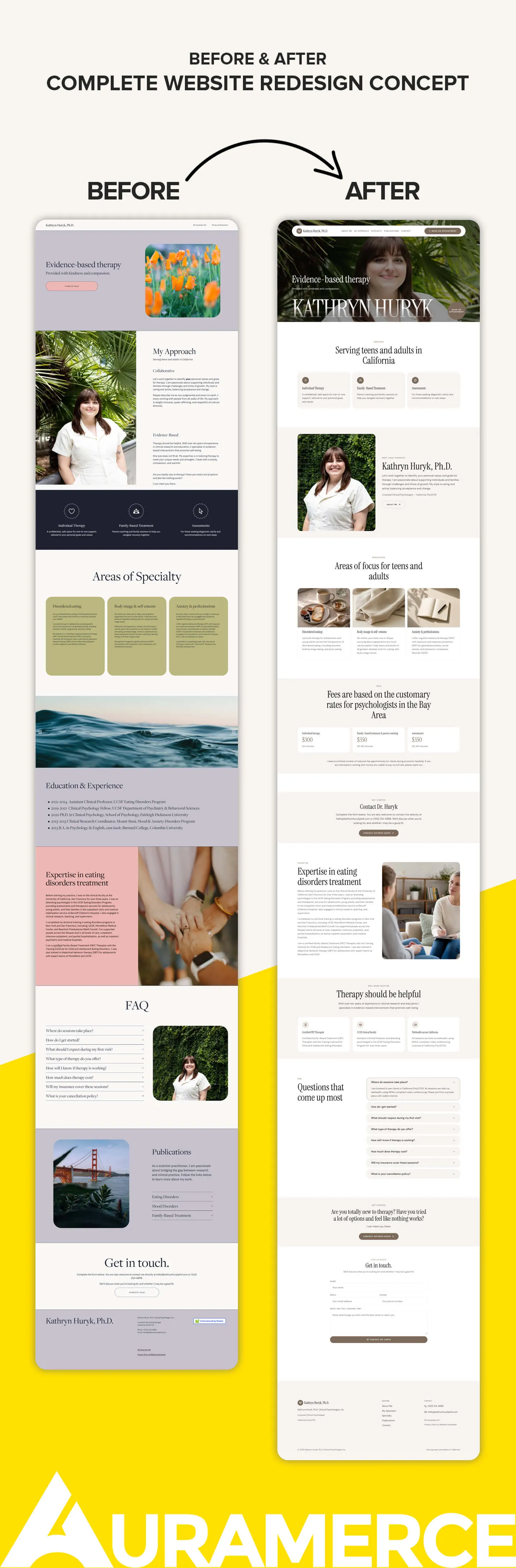
Kathryn Huryk, Ph.D., is a licensed clinical psychologist who provides evidence-based therapy to teens and adults, with a focus on disordered eating, body image, anxiety and perfectionism. Her original site describes telehealth in California and Arizona and in-person appointments in Berkeley. It was a clean but text-heavy page with repeated scheduling links, a long education timeline and a detailed FAQ. This demonstration redesign reorganizes it into a portrait-led website with three services, three specialties, listed fees, an expertise narrative and a straightforward contact form. The result is easier to scan on a first visit, with fees and the closing invitation to get in touch easy to find.
Scope of work
- Complete redesign of a long text-based page
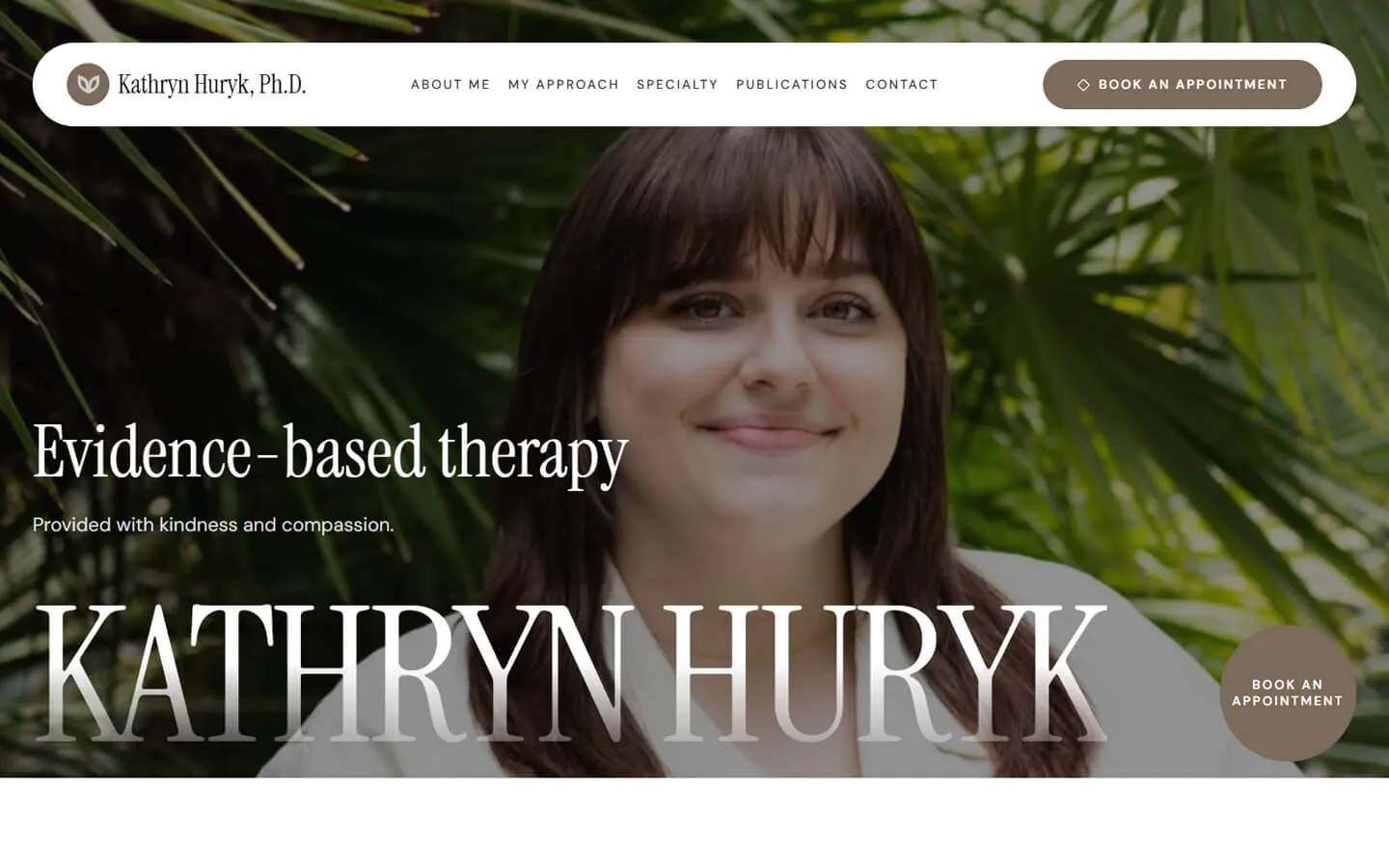
- Floating header with navigation and a Book an Appointment button
- Portrait hero with the headline "Evidence-based therapy"
- Three service cards: individual therapy, family-based treatment and assessments
- "Meet your therapist" section with license information
- Three specialty cards with imagery: disordered eating, body image and self-esteem, and anxiety and perfectionism
- Fees section, "Why work with me" cards and an expertise narrative
- Eight-question FAQ covering location, first visit, progress, cost, insurance and cancellation
- Closing call to action and a contact form
Design details
The hero is a full-bleed portrait framed by green foliage, with a large, light serif wordmark of the name running across the lower edge and an 'Evidence-based therapy' headline above it. A translucent, pill-shaped header floats over the image with small uppercase navigation, and a round 'Book an appointment' badge sits at the corner. Below the hero the page returns to cream surfaces with taupe accents so the text and fees are easy to read. Nature-inspired imagery on the specialty cards keeps the tone gentle for teens and their parents.
This is a demonstration project created by AuraMerce. It is not a completed client project, it was not commissioned by any practice, and no results are claimed.

Explore More Website Work
Want a website like this for your practice?
Request a free redesign preview. We review your current site and show what a clearer, more welcoming version could look like.
Get My Free Preview